Showing posts with label color. Show all posts

Thursday, February 21, 2013

Calming Pink and Grey Pastels

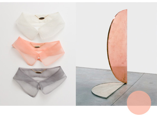
This year I find myself very drawn to shades of pink and grey.  I’ve always loved pastels, but this particular combination has really been resonating with me.  (I even bought a light pink pencil skirt last month!)  I think the soft winter overcast these first few months of the year bring has a lot to do with it.  

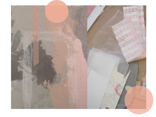
While cleaning up my ‘studio’ (I use that word sparingly) I noticed how much I’ve been working with these colors by how many pink and grey scraps I had laying around.  I had fun putting them together into a small collage.  There is something very soothing about these colors together, in just the right shades.  It was a relaxing little project to work on, and I may create another one soon to escape all the stress I am under at the moment.


 While searching for museum jobs over the weekend I found a wonderful artist fellowship and decided to apply for it.  Of course, the deadline is only days away and I was completely unprepared to apply for anything like this, but this would be a great opportunity and I’m not going to let it slip by. 

This year I promised myself I would start making bigger steps into regaining control over my life instead of letting life happen to me.  I had some major setbacks with school but I’m learning that when things don’t go as planned, at some point you have to step back and reshape your future.  So, I am throwing myself into putting together my portfolio and this application.


It feels great to finally be applying for something I believe in and not being afraid to put myself and my work out there.  I wrote a new artist statement yesterday and am feeling really good about it.  Selecting which works to include in my portfolio is another story, but I am definitely including a pink and grey mixed media piece I made last year.  That makes one down and nine more to go!


Thursday, October 11, 2012

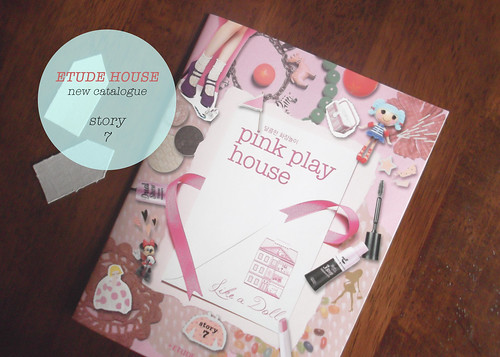
Crafting Inspiration from the New Etude House Catalogue


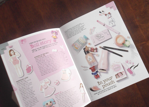
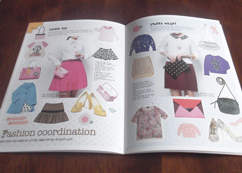
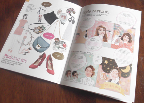
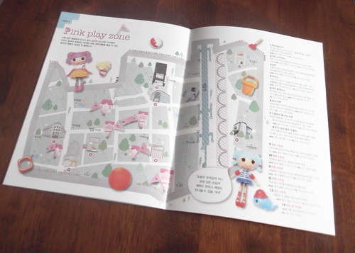
 I received the new Etude House catalogue in the mail!  It’s so lovely that I had to take a few pictures to share.  Earlier this year a snail mail pal in Korea sent me a copy of their last catalogue.  I completely fell in love with the design and she was kind enough to send me a copy of the newest one when it came out.  Their catalogues are themed around a doll house and are designed like a scrapbook.  They’re so fun to look through and if you do any kind of collage work there is a lot to be inspired by.


All of their products have adorably designed packaging.  I don’t wear make up, but I’m a sucker for pinks and pastels.  They provide great pallet inspiration.


This style cartoon would make a fun scrapbooking technique, don’t you think? 

  
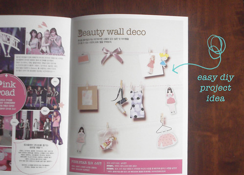
In the back of this issue there was a little project idea for a kind of clothes line version of a mood board.  They stretched a few feet of bakers twine across a wall, and then used mini clothes pins to hang up little bits of decorative ephemera.  Try it out!

Saturday, September 1, 2012

Fragrance Inspired Stationery

I have some letters to send out to friends and decided to make a new stationery set, inspired by Marc Jacobs' Oh, Lola! packaging.  I have no idea how the fragrance smells, but the design is wonderful.  The bright flower shaped perfume card caught my eye in the department store and I picked up a few of them, intending to use them for crafts.  Once I got them home I realized they were too pretty to cut up or paste to anything, so I tucked them away in my ephemera collection.

To hold my snail mail, I wanted to make something quick, colorful, and playful.  I remembered the Oh, Lola! cards and dug them out.  What attracts me most about the design is the bold use of color and shape.  The loosely defined petals are layered to create a poping flower that jumps right out at you, and I wanted to create a similar effect for my envelopes.
Instead of flowers, I cut out some black and white bird pictures and pasted them to vibrant printing paper.  To add to the playfulness, I used contrasting colors instead of monochromatic ones.  After cutting them out and leaving a generous border, I picked some backing paper and cut out large organic shapes.  I layered and pasted them all to some blank pastel manufactured envelopes I had.

After making the bird ones I decided to create another set using some blank labels.  I'm happy with how they both turned out and can't wait to mail them.  I definitely want to toy around with this idea some more and perhaps make some influenced by Jacobs' Daisy fragrance bottle.

Tuesday, August 28, 2012

DIY // Color & Texture Swatches

I’ve never been the type to keep a sketchbook.  The writer in me always takes over and I end up jotting down lots of tone words and long descriptions of my ideas.  Visually, I rely on color and texture instead of sketches.  Both have always evoked strong emotion in me, so when I’m planning out ideas I try to match up different textures with pallets that speak to my written descriptions.

As a result, I end up keeping every scrap of paper or fabric, small or large, which inspires me or holds my attention.  You can imagine the mess I create when I pull all of them out and spread them around the floor, sorting and selecting.  Besides being a hassle to pick up, it also becomes difficult to store so much stuff when I have to keep taking it out again. 

To make this whole process easier I recently made my own color and texture swatches.  They’re super simple to make and great for creating color and mood boards for projects.  You can also scan them to use for design and digital scrap-booking.  All you need is a stapler, some sturdy backing paper, scissors or paper cutter, and a selection of your favorites scraps.
Here’s what I did:
                 
Step One:  Gather materials.  You can see that I used a wide variety, including tissue paper, different fabrics, ribbon, vellum, vintage book pages, handmade paper, and various ephemera.  Don’t be afraid of bold patterns or textures.  Candy wrappers, various textiles, and found items are all fair game.  Use whatever jumps out at you and gets your wheels turning.  Have fun with it.

Step Two:   Prepare the backing paper.  It’s best to keep them on a light solid color that will not compete with your swatches.  I used perfume sample cards and also cut up a few blank index cards.  You can also use card stock.  Whatever you chose, make sure it’s sturdier than the materials you will be attaching.  The next thing you’ll want to do is cut them down to size.  Most of mine are about 2” x 3.”  They don’t have to be systematic, as long as they’re easily handheld and sortable.

Step Three:  Cut out your materials.  This is the fun part.  You don’t want them to be much bigger than 1” x 2 ½” or they will start to overpower the backing paper and contend with your other swatches.  If the color or pattern is not the same all over, cut out the area that you like best, or cut out several areas for a mini set.  For sheer and transparent materials I sometimes cut two pieces or longer strips, then fold or overlap them to show the change in opacity.

Step Four:  Assemble your cards.  Center your swatches on your backing paper and staple them at the top.  I used staples instead of glue because I wanted to be able to lift the swatches and drape them over other materials to see how they interact together.
All that’s left to do is to find a convenient container to store them in.  I’m still looking for something small and cute and might go thrift store hunting for some vintage tea tins.  Now you have your very own swatch set to help visualize all your creative thoughts.

Enjoy!